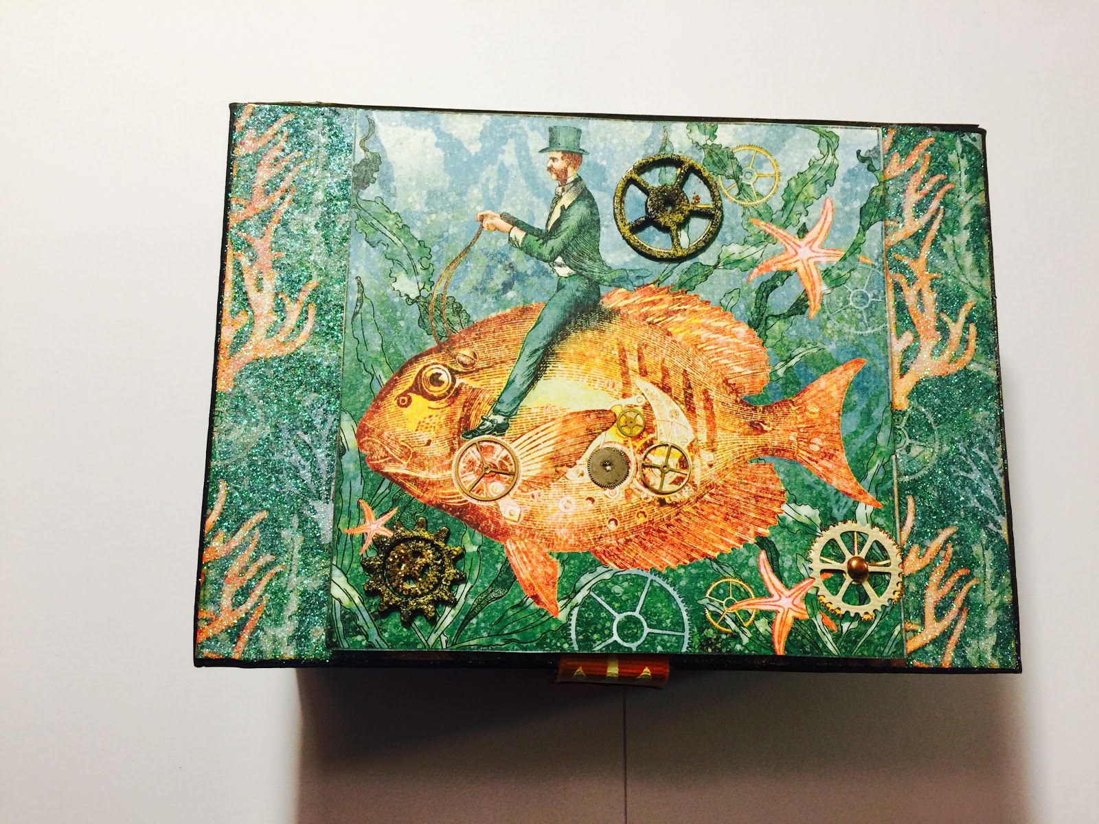
This is the front of the box, here you will see a majority of the circles, but there are plenty of circles throughout each and every piece. It is hard to see in the picture, but in addition to the other circles, there are thousands of them located in the glitter gel behind the raised middle panel in the form of micro glass beads. It is my take on underwater bubbles in this industrial underworld.
I really liked the diver's gear, so I put him on the spine of the box to make sure he was in full view. Behind the diver are more circles, as he is mounted over the matching Graphic 45 pattern paper. No, I was not eating in my laboratory, I was using the fork you see in the background as a tool!
Creating the closure for the book box was quite a challenging task, but I had a lot of fun too. Once I knew how I wanted the closure to look and work, it took several adjustments to get it just right. The ribbon I used was custom coloured, then I had to figure out a solid attachment to the box and keep the pull sturdy without losing the soft touch and texture of the actual ribbon. I demand sturdy crisp construction that serves a function, but I cannot compromise texture, as it is equally important to me. The girl's face that I used as the closure pull is the third layer that completes her postage stamp when closed. I have a lot of fun cutting away layers and stacking the pieces to make a full dimensional image. The layering technique is especially exciting when there are many bits coming out of every direction on the piece, but it also is a good way to make a straight forward portrait come to life.
This next picture shows some of the interior of the box as well as the cover for the book. Circles are located throughout the papers on the interior, but I added more circles to the book cover and inside pages to give them dimension and personal expression. Below, I will list all the products I used to hopefully better convey the textures that do not translate well through photo.
PRODUCTS USED:
PAPERS: Graphic 45 Voyage Beneath the Sea and Core'dinations Nostalgia
FIBERS: Unknown as they were in a kit from Alpha Stamps
TEXTURE FADE: Sizzix Pocket Watches and Steampunk Set
INK: Ranger Distress Inks in various colours
EMBOSSING POWDERS: Ranger Distress in various colours
PAINT: Lumiere 3D Metallic Paint and Adhesive and Acrylic in various colours
OTHER PRODUCTS: Glitter Gel with Glass Micro beads, Metal Gears from several companies, Fimo Clay, Vintaj Glaze, Ranger Distress Glitter Rock Candy and Ideaology
I did not include all the pages of the book because this post is quite lengthy enough. I will add those in a future post. The other projects that were entered I made during the down time with this one. There were so many goey layers that had to dry I am amazed the box and tag book came out unharmed. As always, thank you for stopping by, I look forward to your comments! I had the best time creating these projects!!


I want to see more! This is such a lovely invention, and so well made. This is one of my favorite collections from Graphic 45, and I love the way you've used it here. Thanks so much for joining the fun at the Frilly and Funkie "Going Round in Circles" challenge!
ReplyDelete